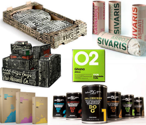
Hand-Drawn Text by The Manual Co.
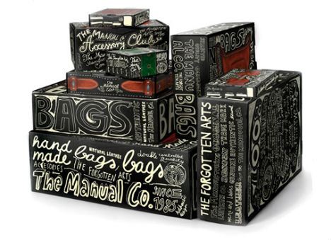
(image via: invadespace.com)
Modern and visually engaging, this hand-drawn packaging was produced for boots, bags and accessories by The Manual Co.Chocolate Cut-Outs by Niamh Richardson
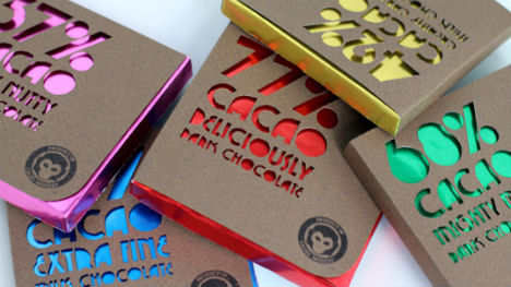
(image via: lovelypackage)
Typography cut-outs characterize this fresh modern packaging by Niamh Richardson. “The text on the front of the packaging was die-cut by hand into rough brown paper, chosen to suggest the organic chocolate. This reveals the bright aluminum foil beneath, which distinguishes each flavour of chocolate. The minimal design reflects the simple, honest ethics of the brand: organic, fairtrade and eco-friendly.”One Village Coffee by Able Design
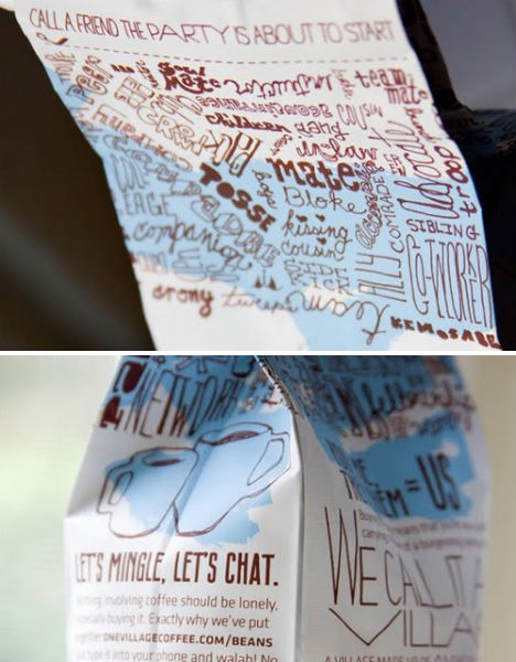
(image via: designed by able)
Eye-catching text covers the packaging for One Village Coffee, designed by Able of Philadelphia. A simple color palette of white, brown and blue keeps the design from being too busy.So Good… Naturally by JJAAKK Design
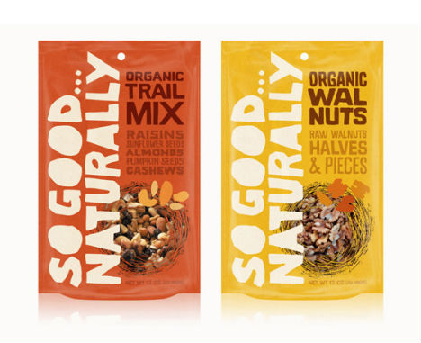
(image via: lovely package)
The So Good… Naturally packaging by JJAAKK Design features large, quirky hand-drawn text. “Design concepts for a line of organic nuts and trail mixes. Hand-drawn type, patterns and a natural color palette make this packaging feel right at home on your next hike.”Sivaris Rice by Pepe Gimeno
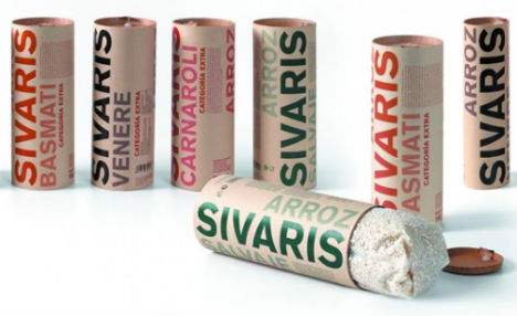
(image via: lovely package)
Not only does Sivaris Rice stand out for its unusual tube-shaped packaging, but the stark colored typography against the natural paper backing will please any grocery shopping design enthusiast.Organic Farm by Lindsay Perkins
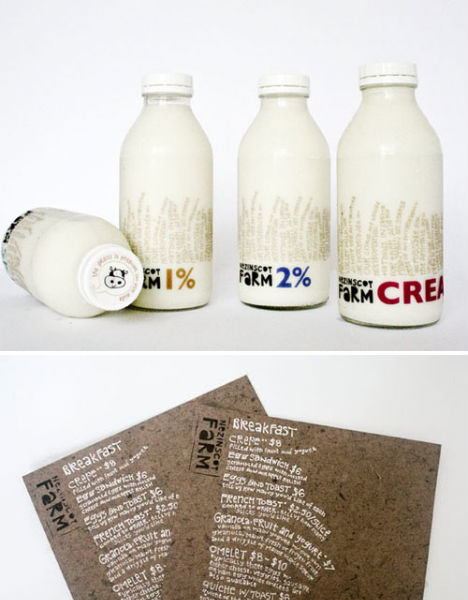
(image via: packaging of the world)
Lindsay Perkins of the Savannah College of Art and Design designed this typography-covered packaging for a small, local organic farm in rural Maine. “Since all produce grown at organic farms is just a little bit different from each other, I decided to make everything about the packaging, just a little bit different from each other. All type used in the packaging is hand rendered in the shape of grass.”100% Chocolate Cafe
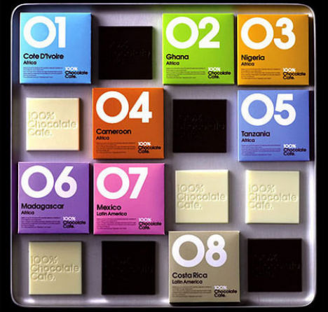
(image via: thedieline.com)
Each of 100% Chocolate Cafe’s 56 flavors – including cheese and black pepper – are boldly numbered on brightly colored packaging, making it easy for enthusiasts to quickly locate their favorites among the large displays.Lega-Lega T-Shirts by MIT
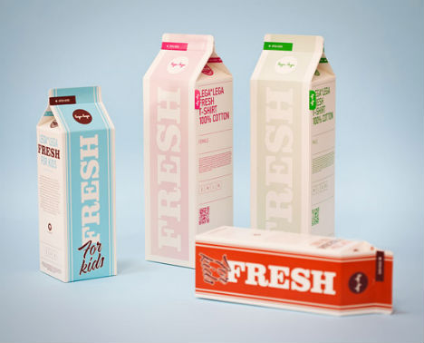
(image via: mit.hr)
No, those containers aren’t filled with milk or candy – they’re innovative packaging for t-shirts by Lega-Lega. MIT Dizaijn Studio in Croatia covered the cartons in typography.Askul Garbage Bag
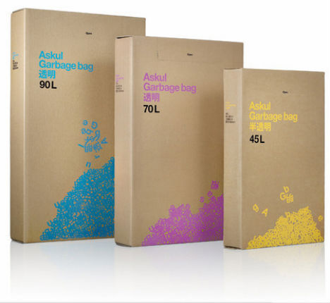
(image via: packaging design archive)
The cardboard box for Askul Garbage Bags, by Stockholm Design Lab, features typography tumbling toward a trash pile.Winner Wine
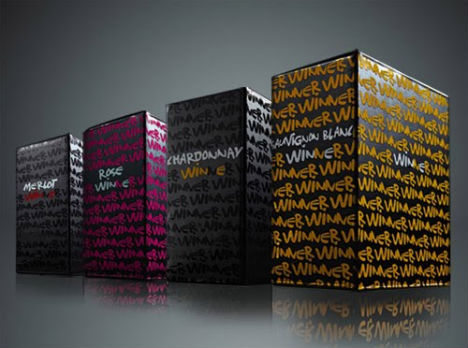
(image via: lovely package)
The arrangement of the hand-drawn font on this box of Winner-brand wine, designed by Constantinos Spaliaras, creates a subtle geometric pattern.Niche Wine Co. by Top Shelf Creative
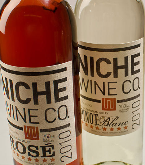
(image via: topshelfcreative.com)
Top Shelf Creative and Geoff Vreeken made Niche Wine stand out on the shelves with basic black type on an off-white background. “The idea was to bring a craft beer feel to the wine category. A masculine, old letterpress approach used to demonstrate the fact that the winery is essentially a four-person, hands-on operation … much like craft brewing.”Brie Bistro Packaging
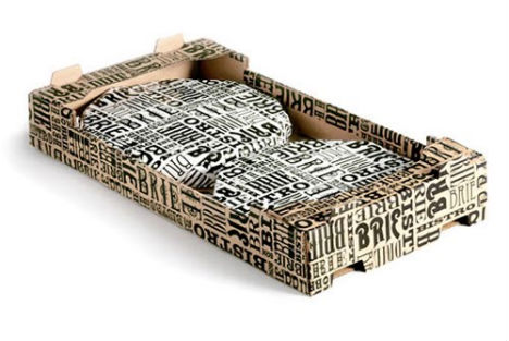
(image via: idkommunikation.com)
‘Brie Bistro’, a brand name of cheese from Swedish dairy company Skånemejerier, is spelled out in a few choice fonts on this packaging design by ID Kommunikation. “Our task was to give the product a new packaging design reflecting the qualities of the cheese and making it stand out from the crowd. The final result is a purely graphic design with inspiration from the beloved French cuisine and old time brasseries.”
Azita’s Hot Sauces & Dry Rubs
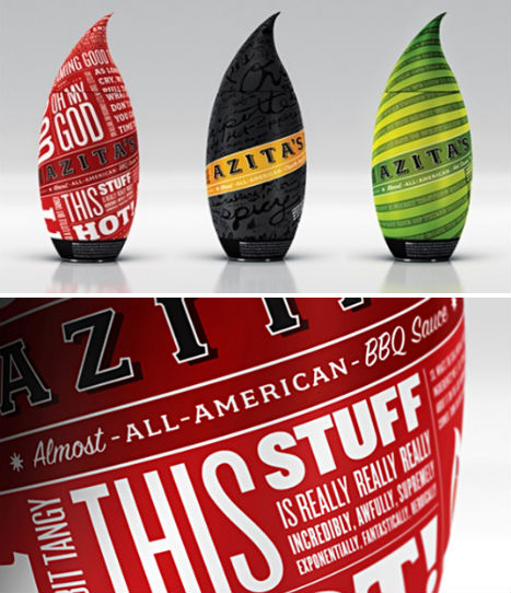
(image via: the dieline)
Type is subtly and not-so-subtly integrated into the packaging for various hot sauces and dry rubs by Azita. Whether blended into the background or featured in bold contrast, this typography has become part of the brand’s identity.Toast-Its Wine
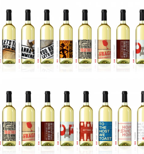
(image via: toast-its.com)
A gift service called Toast-Its sends out an individual label design for practically any occasion from dinner parties to weddings. Each label is primarily made up of typography.Before Grain Dog & Cat Food by 29 Agency
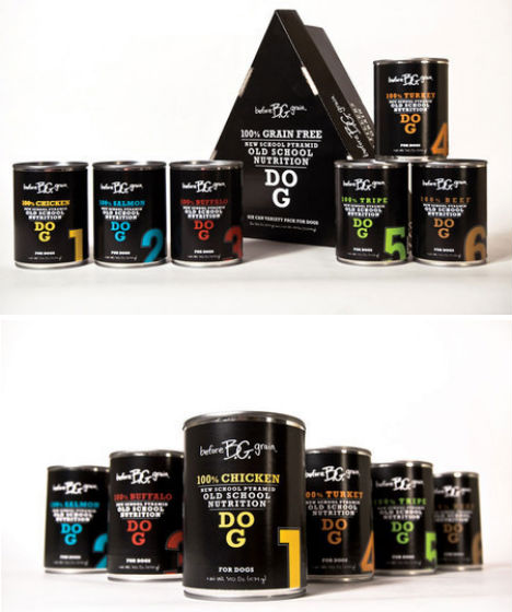
(image via: 29agency.com)
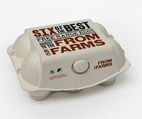
The ‘Before Grain’ brand of dog and cat food got a major makeover thanks to Dallas-based 29 Agency. 29 Agency specializes in high-end boutique pet foods, and it shows in this typography-on-black design scheme.From Our Farms by Si Thorpe
(image via: lovely package)
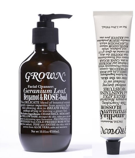
Why shouldn’t products like eggs get well-designed packaging, too? Designer Si Thorpe of the UK gave this ethically minded egg company a clean look with typography that’s a little rough around the edges for a screen-printed effect.Grown Botanical Alchemy
(image via: graphic dirt)
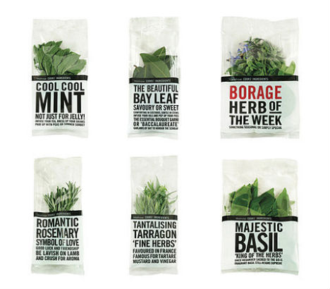
A variety of serif typefaces in different scales give Grown Botanical Alchemy’s packaging a simple and sophisticated feel.Waitrose Herbs by Lewis Moberly
(image via: lewis moberly)
Clean packaging featuring type in black and red lets the beauty of the herbs themselves stand out in this design by Lewis Moberly for Waitrose Herbs.You have read this article with the title Totally Typography: 18 Textual Packaging Designs. You can bookmark this page URL http://tiffanyeatworld.blogspot.com/2011/12/totally-typography-18-textual-packaging.html. Thanks!


