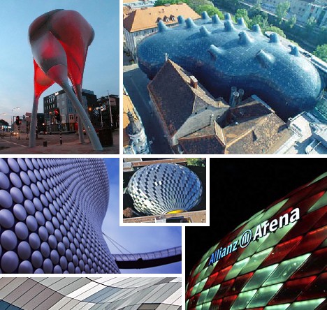
Blob Architecture – sometimes referred to as Blobitecture, Blobism or even Blobismus
is a exceedingly organic type of architecture that exhibits profoundly soft, rounded and curved dimensions. Originating in inflatable buildings, pre-fab plastic structures and computer-assisted design exercises, Blob Architecture has given the world some of its most distinctive and memorable buildings.
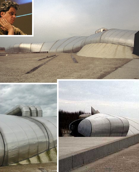
Water Pavilion, Neeltje Jans, The Netherlands
 (images via: V2, MIMOA and H2olland)
Lars Spuybroek is credited by many with bringing Blob Architecture to the notice of not only the world of architecture, but the world as a whole. Spuybroek’s breakthrough design for his NOX architecture firm was the Water Pavilion, constructed in the mid-1990s for the Delta Expo on the Dutch island of Neeltje Jans. The Water Pavilion epitomizes one of the salient features of Blob Architecture, having been designed entirely on computers using specialized computer-aided tools and software such as CATIA (Computer Aided Three-dimensional Interactive Application).
 (image via: NOX)
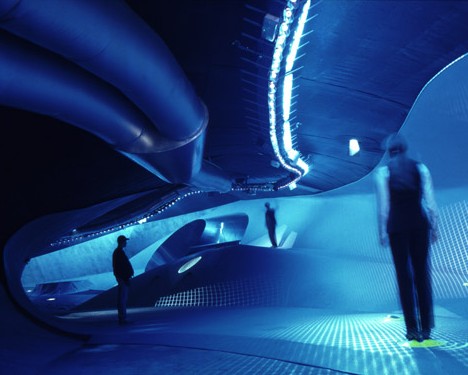
The Water Pavilion is as organic and “blobby” on the inside as on its outside, though the concept of sides quickly becomes irrelevant once floors transform into walls and ceiling exist only according to one’s point of view. Designed as an interactive building flush with mist displays and water jets, the Water Pavilion is equipped with sensors that allow visitors to adjust the sights, sounds and other interior features to suit their particular mood of the moment.
Selfridges Department Store, Birmingham, UK
 (images via: Pak Guns, Detail.de, @llgood and The City Review – Elsewhere)
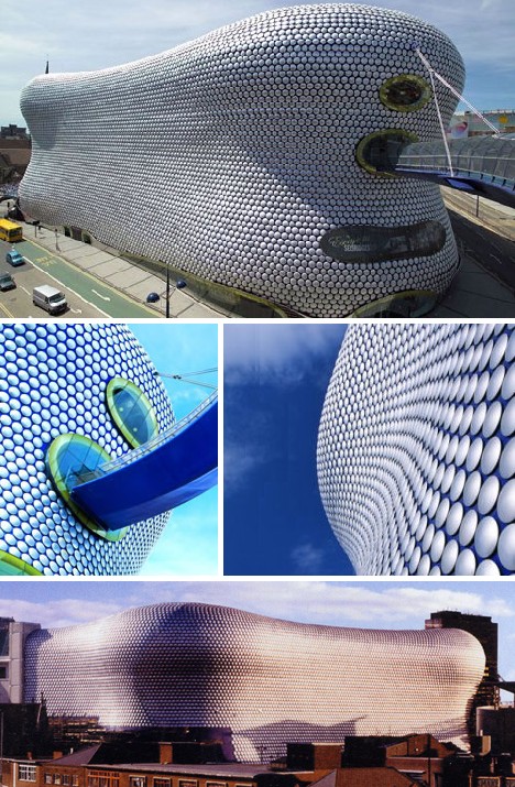
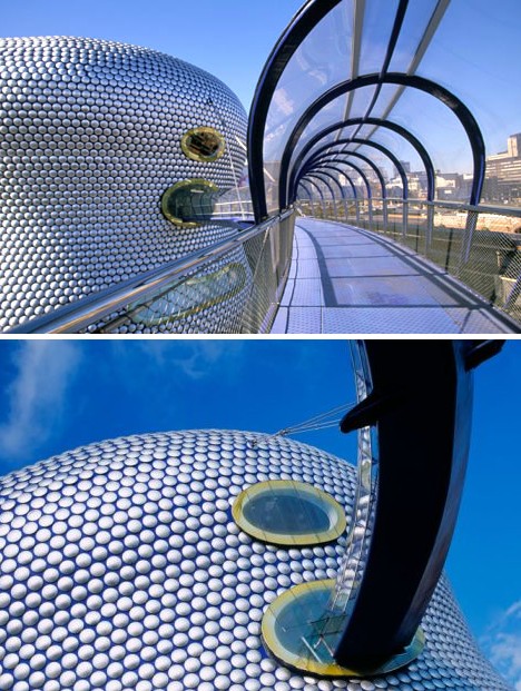
Completed in 2003, the eye-popping design of the Selfridge’s department store in Birmingham, UK, was inspired by “the fall of fabric or the soft lines of a body,” according to architecture firm Future Systems. Looking somewhat like a huge beached whale from a distance, the store’s exterior is revealed to be a mosaic of aluminum discs – thousands of them – that take on the appearance of (again, according to Future Systems) “a fine, lustrous grain like the scales of a snake or the sequins of a Paco Rabanne dress.”
 (images via: Orange and Getty Images)
The dynamic design of the Selfridge’s store wasn’t intended to complement Birmingham’s existing skyline – just the opposite. As Future Systems explains, “Our brief was not only to design a state of the art department store but also to create an architectural landmark for Birmingham so that the building itself would become a genuine catalyst for urban regeneration.”
Guggenheim Museum, Bilbao, Spain
 (images via: Guggenheim.org, Diane Pernet and Twoday)
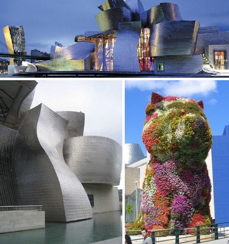
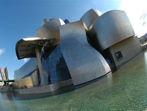
Though often lumped in with other buildings of the Deconstructivist style, the Guggenheim Museum Bilbao in Spain’s Basque Country straddles a number of architectural genres including Blobism. Indeed, it’s difficult if not impossible to find a single straight line or flat plane of any size on the structure. The bulk of the main building is sheathed in polished titanium panels meant to evoke the scales of a fish; fishing being the traditional occupation of generations of Bilbao’s natives.
 (image via: OCB Cal Poly)
Architect Frank Gehry attributes the use of CATIA computer software to the on-time, on-budget opening of the Guggenheim Museum Bilbao in October of 1997. Also of note is the fact that regardless of its highly unusual appearance, the building has been widely praised by architecture critics, political figures and the general public.
Experience Music Project and Science Fiction Museum and Hall of Fame, Seattle, USA
 (images via: Existing Visual)
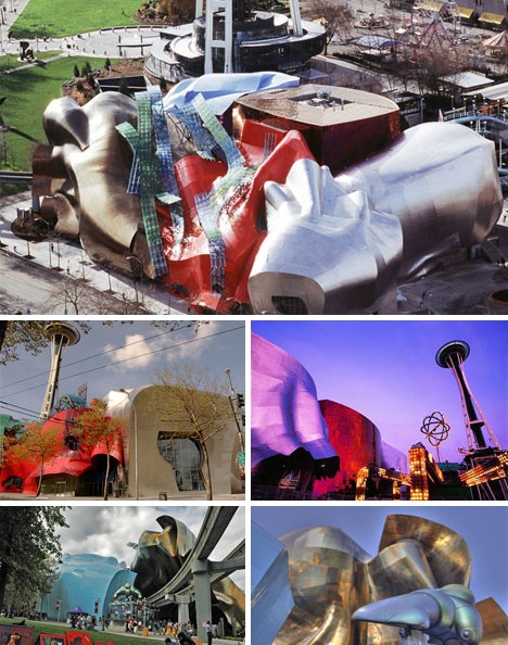
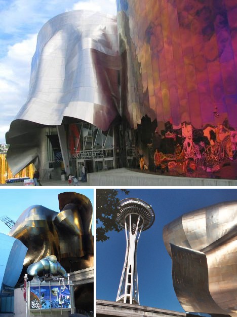
The Experience Music Project and Science Fiction Museum and Hall of Fame (EMP|SFM for short) is another Frank Gehry design located the the Seattle Center. The Seattle Center Monorail runs to – and indeed, through – this unique museum of science fiction and music, giving it a futuristic atmosphere complementary to the nearby Space Needle. The building houses both the Science Fiction Hall of Fame and the world’s largest collection of Jimi Hendrix memorabilia.
 (images via: Igoyougo, Cyberpunk Review and Analog SFF)
EMP|SFM opened in the year 200 as the Experience Music Project (EMP), founded by Microsoft co-founder Paul Allen. In 2004 the Science Fiction Museum was established in the building’s south wing. Unlike other Frank Gehry designs, this particular structure has been harshly reviewed and comparisons range from a hemorrhoid, “something that crawled out of the sea, rolled over, and died,” and, yes, “a blob”. Gehry himself stated that he observed some of Jimi Hendrix’s many smashed guitars to find his design inspiration and it has been suggested he took LSD while listening to Hendrix’s music while in the initial planning stages.
Kunsthaus Graz Art Museum, Graz, Austria
 (images via: Austria Info, Angeee Sun and Trek Earth)
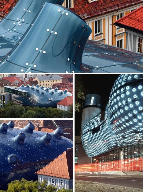
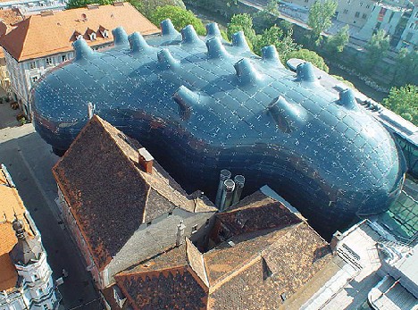
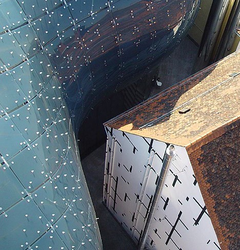
The Kunsthaus Graz looks less like an art museum than the carcass of a giant, space-faring sea cucumber that fell to Earth. It could only be said to blend in with the surrounding neighborhood if viewed with one’s eyes closed. And yet, this big blue blob DOES fit in, helped perhaps by the street-level convergence of the museum’s curved blue skin with the facade of a circa-1847 iron house that formerly occupied part of the site.
 (image via: Wayfaring)
Built as part of the 2003 European Capital of Culture celebrations and designed by Peter Cook and Colin Fournier, the Kunsthaus Graz displays a biomorphic outer surface called the The BIX Facade (for “big” and “pixels”) that can change visual attributes under the control of a central computer. In effect, the eastern side of the building can function as a giant screen displaying imagery that relates to ongoing art and culture events held inside.
Xanadu House, Kissimmee, Florida, USA
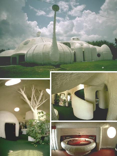 (images via: Systems-Unlimited and IO9)
The Xanadu House in Kissimmee, Florida was the third of its kind and opened to the public in 1983. Billed as the “House of the Future”, the structure was constructed by inflating large, plastic balloons and spraying them with fast-hardening polyurethane expanding foam. Inside, everything from ambient lighting to home security was managed by Commodore computers. Though not noted as such at the time of its inception, the three Xanadu Houses were early examples of what would come to be known as Blob Architecture.
 (image via: Systems-Unlimited)
All good things must come to an end, sadly, even houses of the future. Beset by declining interest from the paying public and an ever-worsening mold infestation, the Xanadu House in Kissimmee was demolished in October 2005. It’s twins in Wisconsin and Tennessee faded from the future into the past around the same time. Here’s a video taken during a tour of the Xanadu House in Kissimmee:
Xanadu – House Of The Future, via Chicagobuck
Allianz Arena, Munich, Germany
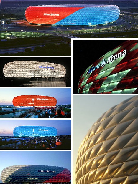 (images via: Aeworldmap.com, Allianz Arena and Mediaruimte)
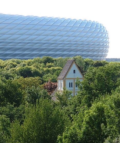
The Allianz Arena in Munich, Germany, opened in May 2005 and is the home stadium for pro soccer teams FC Bayern Munich and TSV 1860 München. The facade of the stadium is made up of 2,874 panels made from ETFE-foil inflated with air. This allows the stadium to completely change its exterior color: red for Bayern Munich games, blue for 1860 München and white for when the German National Team plays. A similar ETFE-foil facade graces New Meadowlands Stadium, which will glow green for New York Jets home games, blue for when the Giants play, and red during music concerts.
 (image via: Wikipedia)
Swiss architects Herzog and de Meuron designed the Allianz Arena to be “the stadium of the future” (there’s that word again) and it is indeed state-of-the-art both inside and out. The stadium holds nearly 70,000 and passed its opening real-use test with flying colors when it hosted a half-dozen games of the 2006 FIFA World Cup.
Miki Disaster Management Park Beans Dome, Miki City, Japan
 (images via: Treehugger and m6699.com)
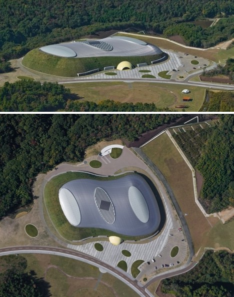
The Disaster Management Park Beans Dome located in Miki City near Kobe, Japan, opened in 2007 and in normal circumstances is a rather fancy tennis dome. It also doubles as an emergency shelter in case of earthquakes and a fire department training center. Visitors enter and exit the structure through a yellow-tiled domed gateway designed to look like a tennis ball partially embedded into the ground.
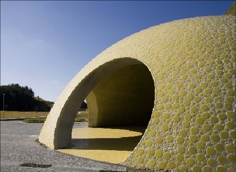 (image via: Treehugger)
“Square buildings are too strong,” explained Japanese architect and project leader Shuhei Endo. “Rounded, curved forms are more continuous and blend in better with nature.” This statement may be considered to be slightly ironic as one of the Dome’s main purposes is to act as a shelter for those displaced by the forces of Nature.
The Sage Gateshead, Newcastle, UK
 (images via: Felling Band, Architecturez and Gateshead Quays)
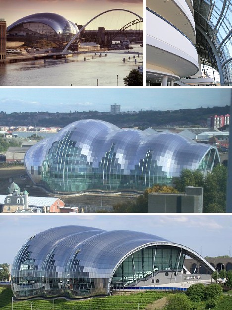
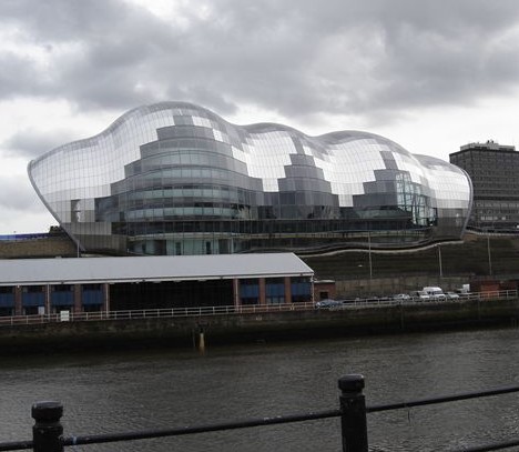
Designed by Foster and Partners and opened in 2004, The Sage sits like a silvery slug, or as Sir Norman Foster puts it, “a very large and friendly caterpillar along the Gateshead side of the River Tyne.” Personally I find it resembles one of those red rubber Kong toys dogs love to chew on. The building displays an exterior formed from curved glass and stainless steel, with the shiny surface offering up a multitude of different visual effects depending on the viewer’s changing point of view.
 (image via: Wikipedia)
The Sage’s unorthodox design isn’t all for show; it’s for shows – of the musical variety. The series of interconnected glass domes that make up the body of the building were planned with optimum acoustics in mind. Although critics such as Private Eye magazine likened The Sage to “a shiny condom”, those who have attended some of the many folk, classical, jazz and pop concerts held at he Sage left, er, satisfied.
Philological Library, Berlin, Germany
 (images via: Inhabitat, FU-Berlin and Metropolis)
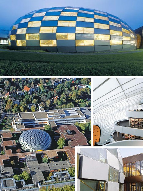
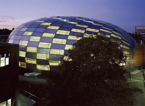
Lord Foster proved that The Sage wasn’t just a flash in the pan when the Philology Library of the Freie Universität Berlin opened on September 14th, 2005. Somewhat surprisingly, Lord Foster was able to maintain the overall architectural sensibility of the surrounding campus when situating his “checkered egg”.
 (image via: Dsgnwrld)
By suspending a double layered dome above a concrete structural core, Lord Foster was able to put in place an innovative climate control system for the library that allowed natural ventilation for approximately 60 percent of the year. As well, the need for artificial lighting is reduced by the use of translucent panels in the domed roof that provide clean, natural lighting even on overcast days.
D-Tower, Doetinchem, The Netherlands
 (images via: Templates.com and Arcspace)
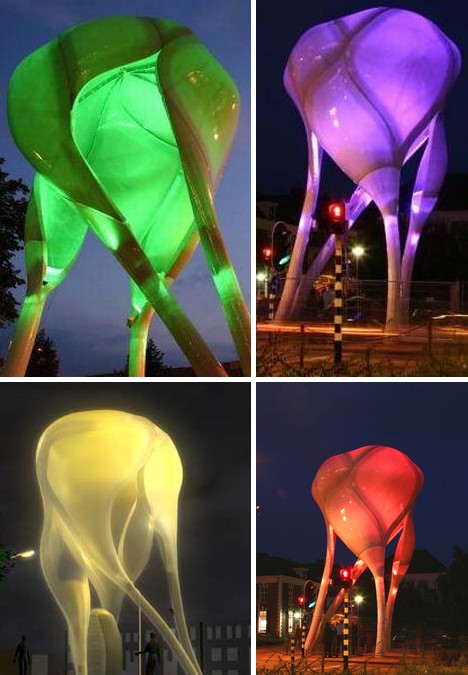
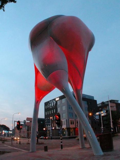
The D-Tower springs from the creative mind of Lars Spuybroek and can be found in the town of Doetinchem. Though it may look like some malevolent deep-sea jellyfish has learned to walk – and stalk humans – the tower is meant to be a fun, interactive piece of architecture.
 (image via: Performative)
The D-Tower is a dull, uniform gray by day but it shows its true colors by night. Actually it shows YOUR true colors, as visitors to the D-Tower website can vote for what color will light up the tower the following evening. Spuybroek has associated certain colors with primal human emotions, such as Love (red), Happiness (violet), Fear (yellow) and Hate (green).
 (image via: World Architecture News)
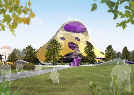
Blob Architecture has emerged as one of the most edgy building styles, ironic in that edges are prominently lacking in its many signature designs. The question remains: is Blobitecture really the architecture of tomorrow, today? And if so, where do we go from here?
You have read this article with the title Blobitecture: 11 Cool Ways Architecture Gets A Round. You can bookmark this page URL http://tiffanyeatworld.blogspot.com/2011/02/blobitecture-11-cool-ways-architecture.html. Thanks!


